Friday, December 18, 2009
Reflections
I think its still worth reflecting on this past semester. It's possibly been the most physically and mentally challenging season of my life. Before coming I didn't hold too many expectations for the GSD, but I (along with many other GSD-ers, apparently) was surprised by the great community and just how helpful people in general are. As with every other time I've moved to a new place, i came in apprehensive about being able to meet new people and develop new friendships, and.. I guess I was surprised once again.
As a student with an architecture background, I think most of my experience at the GSD has been based on a comparison to what I experienced in undergrad at TCAUP. I actually have a list of the things for which I think each place has been better. I realize, that my experience of the GSD has been a completely Inge based experience, but after this one semester the thing I think I appreciate most about my experience at TCAUP now that I look back at it is the respect for the student and a certain openness to ideas. The GSD is full of biases which are sometimes hard to look beyond, but perhaps the strong stances are part of what makes the GSD such a great place for architectural debate. The subject matters I've started to think about here that I never even considered at TCAUP can be summarized in one word: "polemics". The development of ideas that create some sort of architectural debate, responding to precedents and dealing directly with architectural language. I'm still struggling with how architecture in all of its architectural language glory communicates and finds meaning with a "layperson", the eventual occupant of a building, but hopefully that is something I can continue to wrap my mind around over my next three years here. (Oh goodness... three more years of this? haha.)
I also think it's great that the GSD offers a diverse array of ways to participate at the GSD. Activities/student groups range from yoga to ballet to Japan to inflatables to real estate... and the speakers and special guests who are in and out of the building every day are phenomenal.
On the other end of things, it seems like the GSD knows how to have fun (inside the GSD!). Or at least... a few days fo fun. Initiation. The other initiation-like thing. Ping-pong tournament. Stuff. Beer. Dogs.
But really it's mostly painful. You know, good pain... some unnecessary pain. I don't think I've gotten so little sleep for a project ever. Maybe the fact that my studio professor pulls an all-nighter at least once a week and was around studio giving us descrits until 2am more than once would be the biggest clue-in to the culture around here. I did manage to make myself home cooked meals all the way up until the final review (when I purchased my very first thing from the Chauhaus and had to sneakily look around to figure out where to pay so I wouldn't look so lost), but things like a laser sign up at 10 am which people started lining up for at 7-ish the evening before really messed with my sleep schedule. (I got in line around 2 am after needing to be at the GSD until midnight the night before to catch a slot to use the lasers)... also the feeling that I was constantly starting over on my projects instead of slowly working to develop one thing over a period of time. Those would be the unnecessary pains.
It's been quite a ride, but I'm looking forward to a period of rest over this holiday season.
My ride home just arrived. Happy Holidays!
Saturday, November 21, 2009
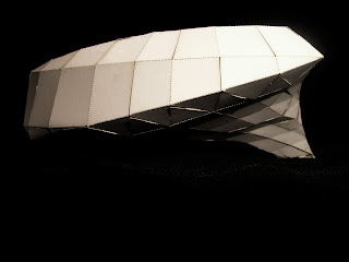
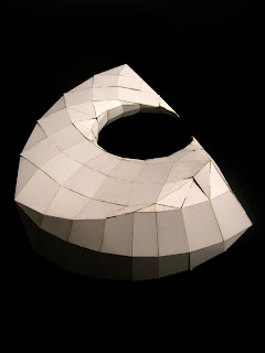
Quad Panelization
Panelized(Cone + Helicoid + Torus) = ...



Tuesday, November 10, 2009
Between Top and Bottom
This image struck me as a new way of approaching design. In general I have only heard of design being one or the other (top or down). In school, the design is clearly top down. For the most part there are no real clients for projects and designs are created solely for the enjoyment of their student and faculty creators. How much is that attitude carried out into reality upon graduation?
Monday, October 19, 2009
GSD Core Studio - Project III [Hidden Room]
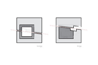
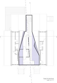
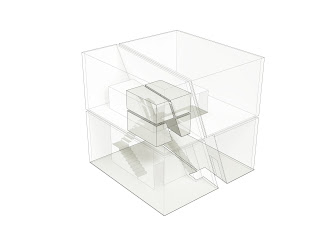 The big dilemma with this project was that it was a silent review and we were only allowed two plans each to fully describe our projects, and the project happened to be about a hidden room. How do you make something hidden legible?
I'm a big supporter of the silent review, because architects too often depend on being able to explain their work. In the end, buildings wont come with captions and they should be able to mean something to the occupants without words. I'm not sure two plans can quite do all the explaining, but it was a good challenge.
VOIDED PRESENCE::
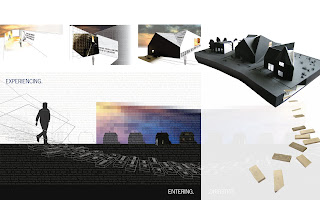
There are situations where the hidden can be constantly present. On the exterior of the building, four masses read clearly as a four-room building, but as the exterior folds in and forms the two fissures defining these volumes, one space is left outside of the fold. The hidden room is the fissure, constantly present on the façade, but never readable as a volume except when entered. Although one can look into the fissure, the view always passes right through the building and out the other side. One can only ever experience a view through the hidden room but not of it.
Upon entering the building, one occupies the poché of the hidden room. Movement constantly circles around and under the room, which conceals itself within a second level of poché: the circulation space that occupies its walls.
The hidden room reveals itself in an unexpected moment between the two floors. The entrance of the room embeds itself into the circulation space. As one moves through the building, the expectation is that the staircases within the second poché will merely take the occupant between rooms on the first floor and rooms on the second floor; but instead, one slides open a door and finds oneself , all of the sudden, outside of the building and in the hidden room. Interestingly the only ways to occupy the hidden space are to step outside or to never enter the building from the start.
Sunday, October 18, 2009
GSD Core Studio - Project II [Lodged House]
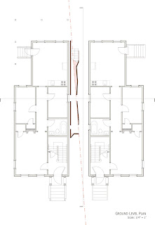
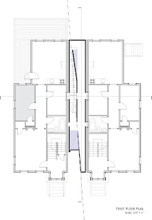
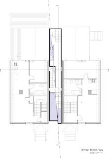
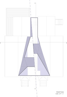
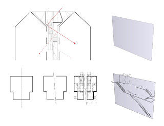
The project asked us to do much more than just create an efficient other space to go between the homes. We were asked to think about the implications of the gable, the ideas behind the form of an american home. We also addressed issues of siting and how to place a building between two basically identical houses symmetrical about a line which would run through the new insertion. Projects covered issues ranging from questions of enclosure and how to provide light to questions of what a home was anyways.
My project envisioned the two neighboring homes as having been one entity split apart by the diagonally positioned site line running between them. Although split apart, the homes are still being stitched together by implied lines carried across by the symmetries in the two buildings.
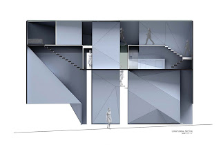
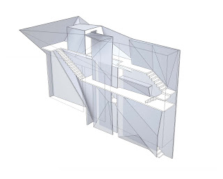
The lodged house registers both the stitching and the cracking within the gap. The site line is extruded as a wall between the two homes (blue-grey plane), registering the crack. The circulation of the lodged house begins to stitch the crack (white), rising from the ground and passing back and forth through the wall of site line creating habitable space within the gap. The stitching movement pushes and pulls on the wall of the site line, stretching it outwards and filling in the gap between the buildings.
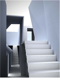
The rendered moment shows a moment where you can see where the site wall has been stretched out to accomodate the staircase. The original line of the site-line can be traced at the top of the image.


Wallenburg
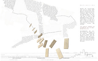
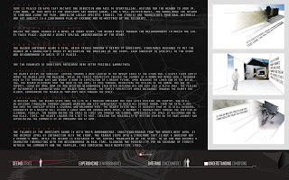
My ug4 studio was the beginning of the Detroit Unreal Estate Agency. We were an international group, working with MFA students from the Netherlands. You might be able to find more about our group online.
[The images are links you can click on if you need to get a larger view to read the text.]
Wednesday, October 14, 2009
Inflatables Project
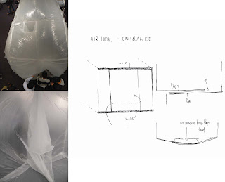
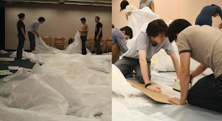
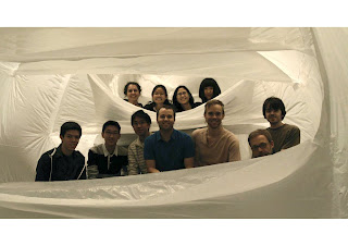
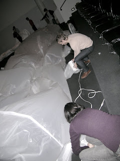
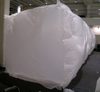
We recently finished off our materials and construction course with an inflatable project, probably the most fun I've ever had doing a group project, and I actually gained some knowledge in building techniques out of it.
Ours was huge. 8' x 8' x 32'.
It was a fun way to explore ideas of interior and exterior by actually inhabiting the air space and having the 'columns' and 'beams' create a new interior on the exterior surface of the inflatable. Also challenging the notion of column and beam as they both become tensile structures to hold the form together and prevent the hallway from becoming a sausage-blob.
The main idea that was really driving us from the beginning, however, was interactivity. See. Touch. Move.






Saturday, August 15, 2009
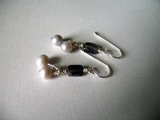
Earring Craze
Friday, July 31, 2009
Pictures of Perfect Nothings
Monday, June 15, 2009
The architect's say on the humanity of prisoners
Wednesday, May 27, 2009
ikebana
I loved how different this was from American style floral arrangments. As a florist for a month doing American style arrangements, I had learnt only to focus on the balance between the plantlife. There wasn't as much concern for the stems, leaves, and the way the flower holder worked as part of the composition. The flower holder was mainly just to hold the flowers and often times got concealed under leaves, ribbons, and decorative papers.
I was also amazed by how with the art of ikebana, the flowers are often made to stand up without any help from the flower holder. It brings a whole new range of possibilities to the art of floral arrangements. My final designs did not make use of this possibility, but some of my original concepts do have the possibility in mind:
Final Concept.
This went through 3 phases eventually ending with a more subtle placement of the aluminum tube within a red oak container. The design also began with a study of the aesthetics and balance of chinese calligraphy.


Tuesday, May 26, 2009
clock
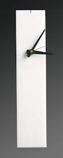 A wall and desk clock still to be fully realized. This idea originated from my search for a simple but elegant clock design and a fascination for the color combination red-black-white. The clock is made with layered white acrylic cut on the laser cutter, yet another technology which I had never used before.
 A metal stand sits into the back of the clock and can be pulled back to allow the clock to rest on a horizontal surface. Hopefully there will be an update soon showing how that detail is incorporated.
Saturday, May 23, 2009
over_thinking
One of the things I've always wondered about since entering the architecture school is the disgust with artificial/cheap materials. The plastic that my balcony is made out of, for example. It's recycled, brown, and has wood patterns imprinted into it. Four years ago, I'm not sure I would have had a problem with it. Now... it seems wrong. Or my dad's suggestion to get brick patterned wallpaper for our family room... ugh.
So what's so bad about all these things pretending to be other things? At the most basic level, it's a lie. There's the whole discussion about architecture needing to be truthful which leads to expressed structures and buildings where even the mechanical systems are left exposed. I wonder, though, one more level down... does an architecture that lies actually effect the day/life of an inhabitant? What's the impact?
I could let my thoughts wander... Maybe materials and structures that lie are part of what trains the human mind to accept falsehoods as long as they produce the results that are seeked. The plastic balcony probably has some sort of forever-warranty against cracking, mold, and discoloration; so, forget about real wood. In a way, it reflects the way people live out other areas of life too. There are people so ready to cash into so many "bad" things just for power or immediate gain. It's just too easy to find some twisted logic to make something wrong into something right.
Does dishonest architecture buy into that worldview?
At the heart of my wonderings is the question of whether architecture really impacts society beyond providing for the practical needs for shelter and useful space. It's a question i struggled a lot with my final project at UofM. I'll be posting my work from that project soon, so maybe it will be better expressed then.
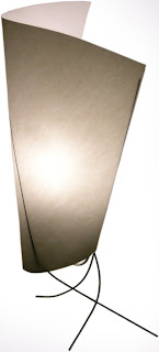
lamp
This project also demonstrated the beauty of constraints. I wish I had more photos of the other lamps produced in the classroom. Even though we were only allowed to use a limited set of materials (paper, wire, lamp parts) the results were quite varied and there was more than one that I could see myself buying out of a store.
Here is my first study model of the final design:

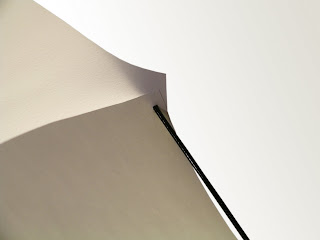
The idea was that instead of predetermining a form for the diffusive paper, the wire would act both as structure and form giver. Many tests were done using different lengths of wire with different curvature as well as various shapes of paper. Below is the final result.

There were also two other ideas I had for lamps which did not get played out: